Attention: cet article est probablement désuet!
Dernière modification : 2008 07 13 12:27
- Date de création : 2008 06 18
- Licence : Creative Commons Attribution Non commercial Share Alike 2.5
- Auteur : Jean-François Fortin Tam
- Contact : nekohayo
 gmail.com
Killing the Desktop Metaphor with GNOME
Here we are, contemplating the whole "desktop metaphor is obsolete" debate again. In this article, I will first propose some arguments why I believe the concept of "icons on the desktop" is counterproductive and perhaps counterintuitive, and I will provide, in the second part, some pointers on how to solve these problems using the GNOME desktop environment, commonly available in most Linux distributions.
This is not just about ~/ versus ~/Desktop. I am here proposing a workflow that does not display any items on the desktop at any time. There is no desktop, only a wallpaper.
The problems
Windows obfuscating contents
One of the most significant problems I can see with the idea of having contents on a "desktop" is that most of the time, that desktop is hidden by multiple windows. To access your contents, you need to minimize a bunch of stuff, or hit ctrl-alt-D, or use the "Show desktop" panel applet, and when you are done, raise all your windows again. You keep moving things out of the way and putting them back in the way, all the time!
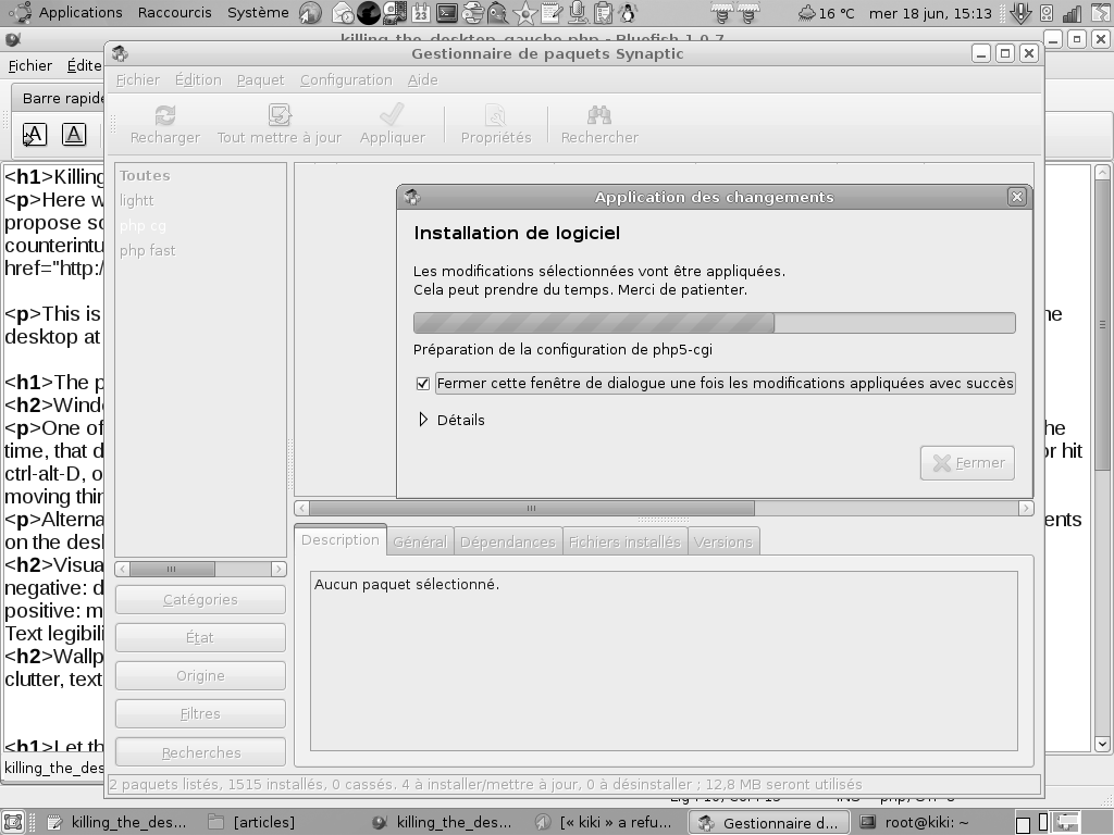
Alternatively, you could use the Places→Desktop panel shortcut, which defeats the purpose of having contents on the desktop. Take the following screenshot for example: the desktop is completely blocked by piles of windows and I cannot interact with it directly anyway. Might as well just use panel shortcuts.
Visual clutter and cognitive consequences
The problem with desktops is that we have so much information to process nowadays, and we get lazy about it. So it "sits" on the desktop for weeks on end, waiting for the right moment to be used (and this, oftentimes, never comes). A desktop that has a limited surface and no scrollbars. A scrolling desktop would be very odd, and bad for spatial memory, now that we think of it.
This has perverse effects: we (in general) tend to let things accumulate on the desktop. The more piles up, and the more it becomes a chore to "clean up", and the less there is, the more we are inclined towards piling up new stuff. It's a vicious cycle that, for some (many?) can create a vague feeling of cognitive overload, or even anxiety (I'm a psychology student, I know I should not throw disorder names around, please bear with me).
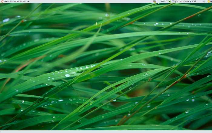
This is due to the fact that you constantly have stuff in your face that "urges" you to be processed, or "reminds" you that you should be doing something else but don't have the energy or resources needed. Oh, I should have blogged this months ago. To make things more visual, here are two screenshots of my computer. One is the desktopless version, and the other is the mess that occurs if I actually use the desktop metaphor.
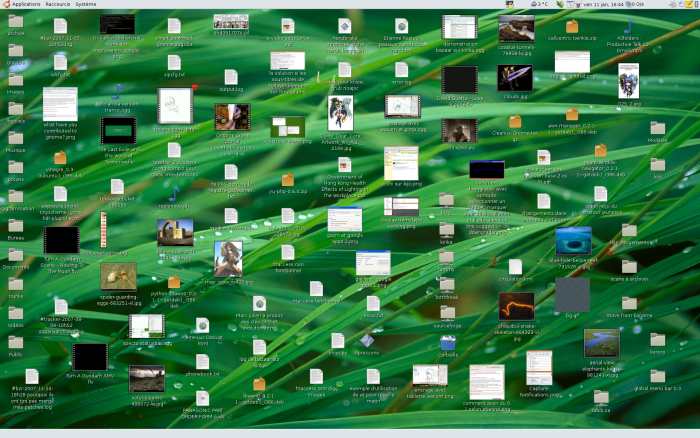
Let's be honest, though. This is not black and white, and having "crap piling up on the desktop" might as well cause the inverse effect to lots of people. Having a cluttered desktop might make some feel more productive or, at least, annoy you enough to force you to either periodically clean the contents of the desktop, or, in a true Getting Things Done fashion, process all your items as soon as they come by (which is a good thing).
Therefore, let's be cautious and say that a cluttered desktop might be at worst unpleasant and stressful, or, on the other hand, a motivational tool. It completely depends on the person. But I know, for years of computing, that I am the kind of person that will let things accumulate and get nervous about them. So I wrote a small script that manages my "queued stuff", and allow me to keep a clean Home folder without a desktop, and live a better geek life (that tool is FrontBringer, more on that later maybe).
Text legibility
Oh yes. Here comes the time where I shamelessly plug a shameful GNOME usability bug that has seemingly gone unnoticed for years. GNOME's text readability on the desktop is very poor, to put it nicely. Unless you use dark, low contrast wallpapers like I was forced to for the past few years. This is Bug 317764. As much as I am an obvious GNOME lover, KDE, Mac OS and even Windows XP do better in this regard. I mean, can you really read these icons' labels easily?

Quoting myself:
The KDE side of things is not the absolute best, but it obviously kicks nautilus' ass in a very brutal way. This is an accessibility issue because it is an area of the desktop that definitely lacks contrast for visually impaired users, or even normal users. Their only choice would be to use no background at all, or a dark-low-contrast one. The accessibility change I suggest here would need to have a "blacker" border, and 1-2 pixels wider all around.Wallpaper enjoyment
Partly because of the bug previously mentioned, having actual contents on your desktop also can reduce your enjoyment of wallpapers if you are picky like me. Granted, you have to be a usability nazi to think about those things, and "enjoying the wallpaper" really looks like a terrible excuse. Don't we have better things to do?
In any case, I would argue that if we could, we would like to see our wallpapers better and not be restricted in choosing them. I calculated that out of my 2500+ wallpapers, only 6% of them can actually be used in a production environment if you use the traditional desktop metaphor.
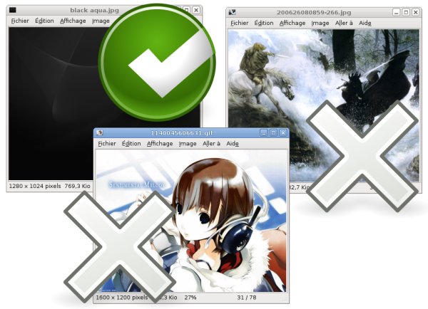
Here's the thing: our icons are mostly bright, and their text labels are bright too. Even with sufficient text borders (if bug 317764 was fixed), having items on the desktop interfere with the artistic flow of most wallpapers (except the really minimalistic ones) in terms of clutter, brightness, contrast, etc. Bright wallpapers or very cluttered wallpapers are, for that reason, very difficult to use with icons on a desktop.
Incoherence with the experience of other folders
Someone made me realize another interesting problem caused by the desktop metaphor as presented in GNOME and Windows: you lose a great amount of functionality of the file manager that is provided for normal folders. This means that to manipulate your desktop, you do not have the same features as the "full-featured" file browser that is used when you open a subfolder.
An exception can be mentioned here for Mac OS (or GNOME if you use the mac menubar patch, or KDE if you can find the option in kcontrol), since the presence of a global menu bar allows the desktop to behave as a "maximized file manager window", to some extent.
Not so intuitive?
The desktop metaphor is often presumed to be more intuitive to use, because the user would interact with that desktop only and see the files and folders that it contains. It struck me, however, that my mother asked me directly if those desktop folders could vanish! Perhaps the desktop metaphor really is good for the trash (no pun intended). My personal view on the matter is that, for someone who was not trained for using the desktop (others can be retrained, or brainwashed), having a desktop or not does not change the difficulty level. Actually, I believe having a desktop increases the difficulty, because it creates one additional one way to access your files and folders. You can easily explain to someone that "Whenever you need to access some of your documents, you just have to hit this Places menu in the panel and go in your Documents folder, or your Home folder". If one considers the Places menu (or a keyboard shortcut, explained further below) to be the "standard" and efficient way, the desktop can be considered counterintuitive.
So how do we fix this?
Let the computer do the work
As for the trash, I don't want to replicate the "IRL Mess"
You can see me coming already: I did rant about having to empty my trash manually, a 100% redundant chore that I do "in real life", but refuse to do with a computer, so surely I will continue on this way? You bet.
Let's see. In real life, depending on how obsessive with GTD or how busy you are (exams, anyone?), your real desktop may look like this (not mine; picture by Rob):
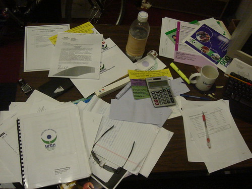
Now, the idea of a paperless office could easily be ported to the idea of a desktopless computer (should we call GNOME a desktop environment in that case? Now that's a good question!); why should we ever want to replicate, on our "virtual" desktops, the mess that we sometimes create on our physical desktops?
Don't push icons around, be productive
The idea here is simple. When using the usual desktop metaphor (here is where the Windows users laugh: GNOME does not have an automatic desktop sorting feature), we keep pushing around icons of documents. Take away the desktop and boom, you don't have to worry about sorting by type, name, last modification time, because it's handled by the file manager. Of course one might argue that we should implement a feature to have automated desktop sorting. I think, however, that it would not solve most of the problems that I enumerated in the first part of this article.
How to do this in GNOME
This is all nice and dandy, but can we do something about it? The answer is, at least for the GNOME desktop, yes. Here are the things that I changed:
- "disable" the desktop (the wallpaper will still show). In GNOME, this is done with a hidden setting in gconf. You can use the graphical tool "gconf-editor" to set the key "/apps/nautilus/preferences/show_desktop" to False by unchecking it.
- set the gconf key "/apps/nautilus/preferences/desktop_is_home_dir" to True
- have a bunch of "favorites" for your frequently used folders (in nautilus, there is a Bookmarks menu just for that, or you can drag and drop the folder in the bookmarks sidebar if you use browser-mode nautilus). These will show up in your Places menu on the panel. If you are using recent versions of GNOME, you most likely already have some generic Music, Videos, Documents (etc.) folders and bookmarks in your home. If the Places menu is not fast enough for your tastes, you can simply drag and drop some of its items directly onto the panel so that you can access them with a single click.
- map a hotkey/keyboard shortcut to show your Home folder's contents. This helps tremendously at being insanely fast and productive, without taking your hands off the keyboard. Since the default keyboard shortcut in nautilus was Alt+Home, it made sense to me to reuse (override) that shortcut for my own use. So what I did was go into System→Preferences→Keyboard Shortcuts, and manually set the "Desktop→Home Directory" shortcut to be "Alt+Home". Now, no matter which application I am in or what the focus is, I can press Alt+Home at any time and my documents and folders will spring up before me instantly, leaving my workflow undisturbed. It is truly a great time and effort saving trick.
Caveats
Spatial memory
This whole no-desktop approach might seem confusing at first (especially since you might need to reorganize your files and folders to be more efficient), especially that by removing the desktop, you lose one advantage: it was good for spatial memory. Now that you have items that are automatically sorted, in a window that may be placed anywhere (and any size) on the screen, you may wonder if this is bad regarding spatial memory. Well, maybe if you are using browser-mode nautilus, not if you are using spatial nautilus. Ha, ha!
Stuff piles up silently... unless you use FrontBringer
As I mentioned previously, for some, the lack of desktop clutter might reduce the motivation to clean it up periodically. However, what I found is that in almost every cases, my clutter was due to "waiting for" items. If this is your case, you may be interested in using FrontBringer to manage your pending documents in a semi-automated way and keeping your home folder uncluttered. This may not be the be-all-end-all solution for Getting Things Done regarding digital documents, but it certainly helps.
Conclusion
The desktop metaphor as we typically know it reproduces some of the concepts of the real world, which brings its share of drawbacks. While GNOME still uses this metaphor by default, we can, however, customize it to fulfill more efficiently the needs of the increasingly complex information flow that we experience on a daily basis.
I am aware that this article flogs a three-decade-old zombie horse. I haven't yet, however, found a more efficient workflow than the one I am hereby presenting, and I would be very interested in comments you may have regarding making it better optimized. If you have something you would like me to add to this article, praises or expressions of undying love, feel free to email me.