Attention: cet article est probablement désuet!
Dernière modification : 2009 08 09 13:39
- Date de création : 2007 07 24
- Résumé : A modest essay on the virtues of the GIMP to help some people understand its user interface
- Licence : Creative Commons Attribution Non commercial Share Alike 2.5
- Auteur : Jean-François Fortin Tam
- Contact : nekohayo
 gmail.com
The GIMP's User Interface Is Not As Terrible As You May Think
Disclaimer: I am not a print artist and I am not a professional.

Over time I have come to see a lot of negative feedback on the user interface of the GIMP, a lot of which come from months/years of experience in Adobe Photoshop or similar programs, creating a general feeling of impatience towards learning a new interface. This article aims to highlight some of the very cool features of the GIMP as well as show out some of its limitations. If you feel like I am saying nonsense, by all means, send me feedback/rebuttals/comments by email, and I will try to add them fast to this article (depending on your timezone).
Let's be clear, I am not targetting big professionals in this article; I can't, because I am not one myself. I'm not really targetting the newcomer either, because I believe they are not entrenched to a particular application and would happily use the GIMP. My prey here is the typical “I played with Photoshop to make my Final Fantasy website layout in Windows, GIMP sucks” average user. Yes, that one.
Drag & Drop
First, you have to realize that the GIMP does allow drag-and-drop pretty much everywhere. If you are not an avid user of drag and drop, I can understand some problems you may have experienced. In an case, if you want to open up an image, just drag it from the folder onto the toolbar or into the layers dialog to create a new layer: this usually is faster than using a file chooser dialog.
In the same way, you can drag-and-drop panels such as the layers, the font picker or the color picker to rearrange the user interface as you want. I believe it is actually important for everyone to take the time to reorganise and personalize the default user interface.
Ever wondered “how the heck am I supposed to fill an area with a solid color”? Yes. Drag-and-drop. Choose your color, and drag from the foreground/background color “square” and onto your image/selection, and the area will be filled with it.
- If you need a way to learn how to drag and drop properly, I would redirect you to Jimmac's excellent video tutorials. They are short, concise, and they are the ones who helped me understand the rationale behind the GIMP. They would explain a lot of concepts better than my essay could do here.
Yep. One of the most common criticisms is the default interface, and one of the most common rebuttal is “You just don't understand it! It's UI art, you insensitive clod!”
I will here show you the way I, personnally, liked to adapt the user interface to my needs. The GIMP can be molded into pretty much anything you want it to be; the fact that it does not have the “grey background” from the Windows version of Adobe Photoshop makes it more like the Mac version (I am saying this because some folks may never have tried the Mac version and believe the grey background is the “One and True Way because Photoshop does it”).
Actually, the following few sections on reorganizing the user interface could be well complemented by a screencast I made recently (video tutorial, narrated with my very sexy voice, pardon my accent). You can download the original video file on this server (in OGG Theora format), but I do not recommend doing that if you are coming from a big news site (we never know), as my home ADSL won't survive long. I would recommend the Google video version below:
Window Management
So I hear you say yeah, what about MDI versus SDI window management? For a long time, the reply was, “This is a problem with your window manager! Go tell that to your WM developer!” The thing is, with the recent advances in window management on the Linux desktop landscape, namely the Compiz window manager (yeah, and Beryl too...), this issue is becoming less relevant. At least for me. I cannot say for sure there is no problem with the GIMP, but what I can say is that I am becoming more and more fond of it as time passes. Here are a few tips regarding managing the GIMP's windows.
Merging down panels into one
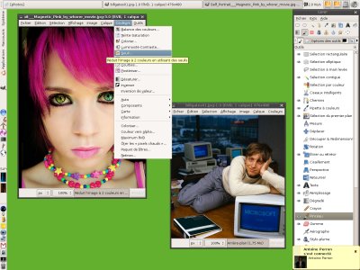
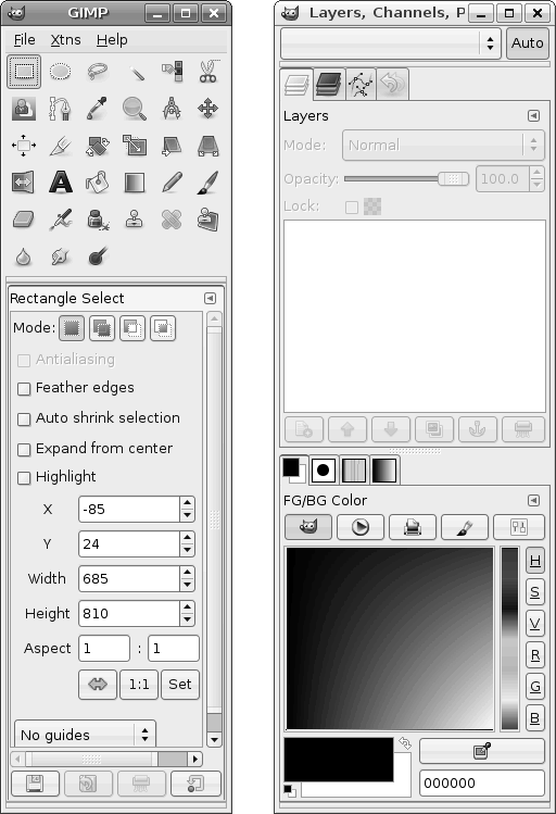
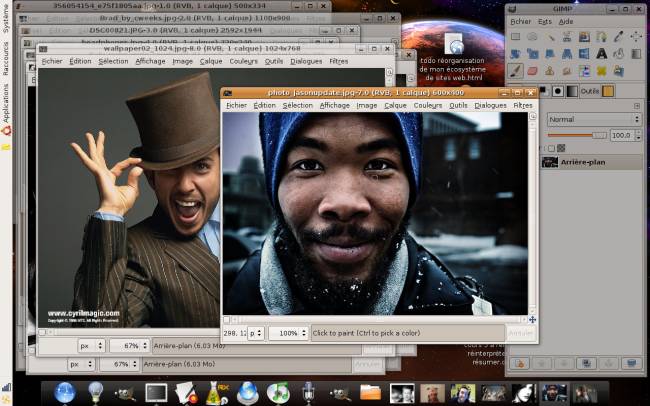
Too many GIMP windows open at startup for your personal taste? Here is the very simple solution I figured out: merge them. Just drag a panel/tab by its handle/tab at the top, and drop it somewhere else – in my case, just below the main toolbar. Rinse, repeat. GIMP's default user interface layout looks like this:
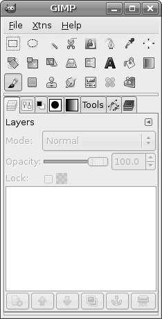
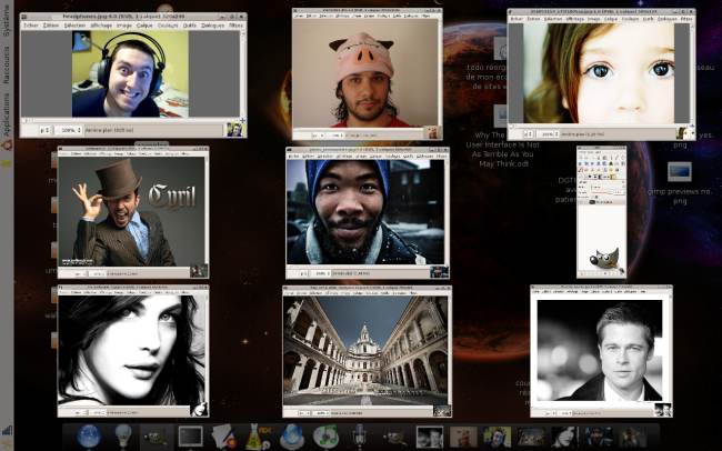
And I end up with this one, after two initial minutes of personalization (of course, it is entirely a matter of taste, workflow and all that):
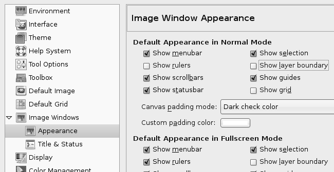
To achieve this, I reduced the size of the icons (less pretty, but you can fit more of them) by changing the Theme to small in the preferences. At the same time, you should take a good five minutes to explore the preferences, as there is a lot of default settings you can configure. I like to disable rulers and layer boundaries because I never use them and they distract me. My settings look like this:
Scale plugin
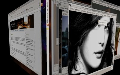
Hommage to Exposé, Compiz and Beryl can both use a plugin called “scale". I'm sorry, Windows users, but you are stuck with Flip3D. Anyway, Scale will allow you to manage many images at once in the GIMP, and I do mean more than the 30 photos you took for Caturday. Here is a moderately busy GIMP workflow (for the sake of simplicity):
Two pictures are worth 2000 words, so here is another one that shows the images in "scaled" view; this is not Mac OS X, in case you did not notice. See that accelerated usability goodness? By a flip of your mouse in a corner of your screen, a hotkey combination or special mouse button, you have an instant access to all your opened pictures. It would sound ridiculous having to read to switch between pictures!
Why are you still using a Window List anyway? This is so, like, 1995!
Let's face it, what we usually acknowledge as the standard way of switching between windows (the “Window List”, also known as the “Taskbar”) is fundamentally flawed whenever you are doing multiple tasks at once. It has been designed horizontally (in general), so that your eyes can read "naturally" from one side to the other (this is just my guess).

This is horrible for power users (those who have lots of windows at once). It makes you read everything everytime. The only way I could see to work around the problem would be to use a vertical window list (which would eat quite a horizontal portion of your screen over its entire height – however, with more and more manufacturers forcing widescreen monitors down our throats, this has become less relevant). I don't know about other desktop environments, but GNOME's panel applet does not allow this.

So. What did I want to point out here? I completely removed the dreaded Window List Applet from my panel (Ha! Ha! :) and just use the scale plugin instead. When you are doing active design, why struggle with reading the tiny names like DCF0023.JPG and ecchi-desu-desu-logo.xcf when you can see a bird-eye view of all your applications – or only the pictures opened in the GIMP?
Boycott the Window List Applet. It kills kittens.
Workspaces
If your desktop environment supports it, you should definitely use workspaces for separating your graphical work from the “outer world”. Keep your instant messages on some other workspace, your web browser windows and folders on another, etc. If your images are all on the same workspace (well you could even split them into other workspaces and make the main GIMP window stick to all workspaces, too), you will have no problem managing them. This becomes especially true with the Scale plugin.
Setting GIMP's window types
For those of you who cannot afford to use a composited environment and love the window list applet, there may be another way. Somewhere in the GIMP's preferences, it is possible to adjust the "window types" and set the toolbars to "utility", which makes them not show up on the "taskbar". They are still independently controlled, however.
Color menu: forget GIMPShop
There is a popular hack that appeared sometime in 2005 called GIMPShop (lawsuit pending :), that transformed the GIMP user interface to look more like Photoshop's. While I question the reasons of its existence, I acknowledge the fact that it has piqued the interest of many. I have not looked into the matter, but GIMPShop may be the cause of some user interface changes I saw in GIMP 2.3 (the development version for 2.4), namely the “Color” toplevel menu.
As I am an amateur photographer, I can testify that the Color menu is a gift from the heavens. This is the menu I use the most often, and not having to go deep into submenus is much easier to do than being careful not to “slip” with your mouse (I know, you can “detach” menus).
What I here want to ask the few who will read this essay (if any), do you think GIMPShop (if you tried GIMP 2.3) is still relevant? Really, from what I remember, GIMPShop pretty much just rearranged some menus around.
What I want to point out here is that after using GIMP for a while, I sat down in front of Photoshop again, and I was utterly confused. Photoshop's menus made no sense. An “adjustments” submenu in the “Image” menu? How is that more usable than a “Colors” menu? The rest of the menus are in the big part similar (Filters, Layers, Image, View, etc). “Image Size” is called “Resize Image” in the GIMP. Pretty close.
Free as in Both
The GIMP is free of charge and free to share, modify, fork, burn with a flamethrower, use for making cats on Caturdays, etc. How cool is that? No stupid keygen and activation code copy-pasting typing to confirm that you are who you are! GIMP loves you for who you are! Well, you knew all that already.
Network support (through gnome-vfs?)
You can (at least in GNOME) edit images directly over the network, without having to manually transfer the files or mount the shares – at least, not with fstab: I actually edited images over an SSH connection that I made using Nautilus, GNOME's file browser. I don't know if a similar functionality is available for other environments though, as my guess is that GIMP uses gnome-vfs to do that. But it certainly is neat and worthy of mention.
Fast brush size controls, at last!
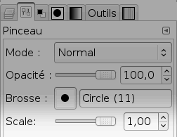
In GIMP 2.3.14 and newer, you can now change the size of a brush without editing the brush, that is "on-the-fly". This is something I, and many others, have been wanting for a very long time.
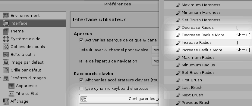
For those of you still using the 2.2 series, it is however possible to work around the issue somewhat, using parametric brushes. Don't let that scary term fool you; pretty much all the regular brushes are parametric. What you need to do is simply go into the GIMP's preferences, in the "interface" category, and click the "Configure keyboard shorcuts" button (or something like that). Actually, it seems you can also map pointing devices to that, allowing you to change the size of the brush by scrolling your mouse wheel. The screenshot below explains better than I do:
So, what sucks?
It all depends on the usage. Most of these problems are planned to be fixed... eventually, when GeGL arrives. I know, I know, it feels like a long wait, so you most likely have to be patient, work around the issues, and enjoy when they are finally fixed – it's like a delicious candy, you will enjoy it more if you have waited and worked hard for it. So, without further ado,...
Those tiny previews!
Filters have tiny preview windows – for the rest, you don't have any preview at all. You have to apply the filter, see that it's not what you wanted, retry or change filter. Over and over again.
In the cases where you can preview the filter, there is no “direct manipulation”: you see the preview in a tiny square inside a tiny dialog. I always end up having to resize up that dialog, and I hate doing that with a passion. Hello, we are in 2007, I have a high resolution screen, and I would like to see the preview of my effects directly onto the image. It's much more intuitive anyway.
Yes, I guess those that do not have previews are script-fus (like the drop shadow effect). Weeell... that doesn't matter. Other apps consider them as effects and can have live previews for them, right?
But wait. I was actually given an interesting explanation for this, thanks to Saulgoode on an ubuntuforums thread. Here is what he wrote to me:
[...] the previews exist not because of any limitation of screen size, but because plug-ins have a limited interface to the GIMP's core data. The communication between a plug-in and the GIMP's core is limited in order to maintain a stable framework within which plug-ins can work -- this is analogous to a stable API in library sources. Plug-ins should be transferable between different versions of the GIMP without recompiling either the plug-in or the GIMP. (This is true as long as the major version number has not been changed; GIMP plug-ins for version 1.x.x are not guaranteed to work with versions 2.x.x, and vice-versa) Plug-ins also should not be capable of causing the GIMP to crash; the plug-in might very well crash, but the GIMP should remain functioning -- this is analogous to plug-ins not having SUDO privileges and therefore only can corrupt themselves. This makes it much simpler to debug problems and maintain development (not to mention placing responsibility for plug-in problems with the plug-in's author, where it belongs). The need for restrictions to plug-ins' interfacing with the GIMP means that any data the plug-in accesses and/or modifies need to be passed through interprocess messaging. It can be very slow to transfer the amount of data inherent to graphic images in this manner, hence the employment of "preview windows".Text tool
Aaargh. It is strange to use. You cannot use formatting on portions of text, so I just create separate text layers for each portion that needs special formatting, size, etc. It does allow me a little bit more control, but it is a somewhat slow technique.
You want to make the text follow a nice curve or something? You may be better off doing it in Inkscape by attaching text to a path!
Need to make the text legible with a nice (but subtle) shadow? You need to do it with a filter that is applied manually and statically; I wonder if this could be done in realtime (attaching filters to a text zone or layer) with GeGL. My uneducated guess is yes.
No layer styles / realtime, dynamic effects
One of the features I used the most in Adobe Photoshop years ago was the “layer styles” (was it actually called like that?); it allowed you to, for example, add a shadow effect to a layer, adjust it anytime and toggle it on/of with a simple checkbox. I can testify that the readability of my text is much less in GIMP than what it used to be with Photoshop, for the simple reason that it is painful to do so. Yeah, you can add a shadow. But you have to do trial and error, and whenever your project rules change, you have to do it all over again – so I nowadays don't do it much if at all. Sad!
No real CMYK yet
Serious print artists (I am not one of them) cite the lack of cyan-magenta-yellow-kelloggs color support in GIMP as the biggest flaw. No joy for those (although it will be fixed by GeGL some day).
No adjustment layers
I personally have a very very vague idea of what an adjustment layer actually is, but what I do know is that GIMP does not have them, and will (most likely) not have them, according to some wiki page that states that adjustment layers are not the right way of doing it and GeGL will make something better. Quote from that page:
adjustment layers are a hijack of the layers concept that was needed in the 1990s to get things done and to be re-adjustable later on; with GEGl there is no need for it anymore, and GIMP can miss like a toothache: the complication, the unnatural way of working and the fact that the guiding principle above goes to hell;Cannot select multiple layers
Along with the fact that you cannot make layer "folders", you cannot select multiple layers simultaneously in the GIMP. While being able to do that is not a vital feature, it is a nice time saver.
JPEG exporting preview in a different window,
Seriously, WTF. Why do I have to see a preview of the compression in a clone image window that appears behind my current dialog (I know I know, bug my friendly window manager developer)? The important issue here is that it's pretty confusing to have the same image twice – and the only difference between the two is a JPEG compression (you need a designer's eye to notice that).
If you cannot make it “simulate” the compression in the original image window, don't make a new clone window: just embed the preview inside the export dialog – isn't that the purpose it was meant to fulfill?